joiners

Exhibition News from Noel Myles by Graham Dew


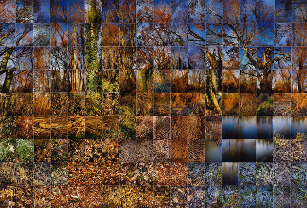
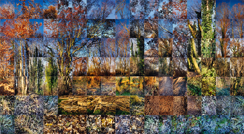
Regular readers of this blog will know that I’m a big fan of the joiner pictures of Noel Myles. I really recommend seeing his work when exhibited, because his images are generally quite large, and work well when seen large. Web pages and computer projects just don’t show the size and clarity of his work. Noel currently has a piece called Earth that is on show at the Sainsbury Centre for Visual Arts. Made up from 288 individual 12” x 8” prints, it is, as you can see, huge, measuring 2.75 x 6.53 m. He reports having very sore thumbs after pushing in over a thousand pins to mount the PVC reinforced prints. The installation will be on view until Easter at least, but due to alterations at the SCVA, it is worth checking in advance.

Earth © Noel Myles
Earth © Noel Myles

If Noel’s Still Films images can be considered as a form of photographic cubism, then this work is a close parallel to the colour field (!) work of Mark Rothko. The hue of the ploughed fields is as found; the typically rich red soil from the around Hereford and the light hues from East Anglia. To quote Noel: ‘I took the photos one winter in Suffolk, Essex and Herefordshire. I knew I wanted the red soil that's there. The bluish tinge is frost. I was using the different colours in a similar way to an artist using paint; the overall colour of the piece emerging with the placement of one colour next to another. After this series I moved from film to digital. Changing rolls with numb fingers and dropping them was too much for me.’ 

As with his other joiner pictures, you can spend much longer looking at these large composites than you can with individual photographs. The eye scans and rescans the image, picking up similar, but often different, detail with each glance. Because we are familiar with photographs and largely believe them to be an accurate document, we read them very quickly. With paintings and other manually crafted images, we take longer to explore and decode them. The experience of viewing Noel’s abstract expressionist composites is much closer to viewing a painting than a photograph, and one of the reasons they are so rewarding to see on the wall.


Following on from his successful exhibition at Cambridge University Noel Myles will shortly have the opening to a new exhibition at the Minories Gallery in Colchester. This is a joint exhibition with James Maturin-Baird called Between Photography and runs between March 16th and May 11th. Noel tells me that he will be showing a fair amount of new work which I’m looking forward to seeing.


Lessons Learnt by Graham Dew

On the southern reaches of the city of Winchester lies the rather lovely church of St Cross. It has set of very attractive almshouses attached to it. I’m not sure if they still receive pilgrims and offer them shelter on their journeys, but there are a good number elderly residents who have their home there. It must be a very charming place to stay, located near to the river Itchen with views to St Catherine’s Hill beyond.
 

St Cross 2, November 2012 © Graham Dew
St Cross 2, November 2012

When creating joiners or still movies, I find it almost essential to have a reasonably clear idea of where I want to shoot and how I’m going to tackle the picture making. It helps to know where you need to go, how you might start to collect material for the image, which lens to use, and some idea how the final composition will be put together. All of these are good starting points, but sometimes the outcome is rather different to plan.

I had originally hoped to make a composition that took in a tree-lined path that runs to the east of the church, and included the church to one side. In this way I hoped to create an image of the church, almshouses and path that I’m sure many people have in their memory, but can’t actually be seen from a single viewpoint. I shot the material, but when I came to compose the picture in Lightroom I found that I had not really collected the right constituent pictures that were needed. 

St Cross 1, November 2012 © Graham Dew
St Cross 1, November 2012
As you can see, the finished joiner is effectively two separate images. The cells for the church and the cells for the path and trees work well enough. But I did not capture enough linking frames of the ends of branches, and have ended up with an uncomfortably sharp boundary to the trees. I also felt that the church was not sufficiently large enough in the frame, so maybe I should have walk closer or used a more powerful telephoto (which I don’t currently have).


Once I felt that I was through with the shooting of frames for this joiner I then walked up closer to start photographing the frames for the joiner that you see at the top of the post. Dealing with the flat distant planes of a building is much easier than tree branches in the foreground, and I quickly built up an image that looked in and around the church and almshouses.

So what were the lessons learned? Ever tried. Ever failed. No matter. Try again. Fail again. Fail better.
 

Winchester Cathedral by Graham Dew

Winchester Cathedral, June2012 © Graham Dew

Winchester Cathedral, June2012


Following on from the Orbit post, this joiner of Winchester Cathedral was originally shot with the intention of compiling the image as a multi-layered panograph. I deliberately took many shots angling the camera clockwise and anti-clockwise from the horizontal to give a lively feel to the final image. I had started to create a panograph in Photoshop, but this was very time consuming placing and turning the individual cells, especially once the file size started to become large. The composite rapidly grew to around 2GB and ended up lying around for several months unfinished because I didn’t have the time to complete it. But recently I’ve found Lightroom a much faster tool for creating joiners, and so I wondered if the material shot of the cathedral could be used successfully for a joiner. I’m pretty pleased with the result, and it’s surprising how well a joiner can hold up even with poorly placed horizons and verticals.

There are a couple of things about this picture that might be of interest. Firstly, this picture was shot very close to midsummer’s day in June this year. Naturally, all churches and cathedrals in this country face east, but the best views of Winchester Cathedral are from the north-west. For most of the year, and for most of the day, this view is in shade and the sun makes the sky uncontrollably bright. However, at the height of midsummer, the sun sets a few degrees north of west and so for about an hour before sunset the sun illuminates the cream stone and makes glow a lovely orange. So the time was set, the other part of the problem was to capture the as much of the cathedral as I could. All around the cathedral yard there are many trees that obscure the view. To take the component photos I needed to walk around the cathedral grounds, capturing clean lines of sight of the building and then moving onto the next available view. In this way I was able to build up a comprehensive view of the cathedral, even if the final composite made the building look more of a Frank Gehry design than an 11th century Norman masterpiece.

Orbit by Graham Dew

Orbit Panograph, Queen Elizabeth Olympic Park, 2012 © Graham Dew

Orbit Panograph, Queen Elizabeth Olympic Park, 2012 © Graham Dew

With the first heavy frosts of winter arriving this week it’s easy to forget that the London Olympics and Paralympics finished only a couple of months ago. For a few glorious weeks, the rain stopped and the country came together to cheer on the athletes of the world and enjoy the spectacle. Every time the Olympics come up in conversation, the abiding memory everyone shares is how good it was; how everything worked and worked well, and how much joy it brought to our country. There has been much said about the legacy of the games, of how the facilities and infrastructure will be of benefit in the future and how British sport has benefitted from the games. I hope one aspect of the legacy is that we will remember that Britain is a great place to live and that we can still achieve great things.

There was a fair amount of scepticism before the Olympics, including the sculpture/edifice/tower that is the Orbit. Designed by Anish Kapoor, this idiosyncratic structure suddenly seemed to fit into the rest of the Olympic landscape once the games were underway. Its twisting nature is easily seen from below but is best appreciated when walking down the spiral staircase when exiting the viewing platform at the top. It’s a fun, slightly ridiculous folly and so I thought I would try to reflect that in the way I photographed it.

Inspired by the energetic panographies of Mareen Fischinger I decided I would create an image made of many overlapping cells. With scarcely any vertical or horizontal lines in the Orbit, it seemed appropriate to turn the camera 45° and use square cells. I should have switched on the gridlines in my camera, because I managed to hold it at about 40° throughout the whole of the sequence of shots. At least I was consistent!

I have used transparency for all of the cells (set at 70%) to give some bleed through of overlapping cells. This means that the image needed to composited in Photoshop as the print module in Lightroom does not allow transparency of images. By pre-processing the cells down to 600 pixels square I managed to keep the overall file size down to realistic levels, but if LOCOG would like to buy a giant version I will be very happy to create a high resolution version…

Making Joiners in Lightroom by Graham Dew

In my Mother’s Garden, Autumn 2011 © Graham Dew

In my Mother’s Garden, Autumn 2011


I’ve recently had some unexpected time at home which has given me the opportunity to catch up on a few joiners that I had shot in the past but never found the time to finish off as completed images. Up until this summer I used Photoshop to build my joiners which has worked well enough, but does place rather heavy demands on the computer in terms of disk, RAM & processor performance. But increasingly, I’ve been experimenting with Lightroom, and now have a pretty reliable alternative way of building still movies. This newer method centres around the use of the Print module, which allows me to build and re-edit multi-cell images with very little in the way of computer resources. Lightroom is a parametric, metadata driven editing system unlike most others including Photoshop, which work on pixel by pixel editing. The upshot of this is that the final size of the completed joiner does not have to be considered until the very end of the project. Very high resolution, very large print size images can be prepared as easily as small web based output; they just take a little longer to be processed. 

Crucially, since the arrival of Lightroom 4 I can now save my print layouts and revisit them at any time, unlike in Lightroom 3. There are some weaknesses in the method; I would dearly love to be able to zoom into the display in the print module, and it would be great if I could use the Develop module functionality whilst still displaying the Print module view. But overall, using Lightroom is a much quicker and freer way of constructing joiners than using Photoshop.

Lightroom became my editor of choice about a year ago. Prior to that I was using Photoshop but rarely left Camera Raw when editing my pictures, so the transition to Lightroom was fairly easy and obvious.

The picture above is made up of photos taken a year ago on my LX3 compact. I wish I had found time to put it together sooner as I’m quite pleased with the result. The individual cells were taken with the lens set at a focal length equivalent to 60mm in 35mm film terms.  If I were to reshoot in the future I would probably use the G3/Olympus 45 combination which would give small cell sizes, but I think the picture holds together well with only four cells height. It reminds me that pictures can be made whatever the weather; blue skies and bright sunshine are not a pre-requisite for a a successful image.

In my Mother’s Garden, as Seen Through the Bathroom Window, Autumn 2011 © Graham Dew

In my Mother’s Garden, as Seen Through the Bathroom Window, Autumn 2011

Making Joiners in Photoshop by Graham Dew


About a year ago my Arena friend Tony Worobiec approached me to write an article about creating joiners in Photoshop. Tony is the prolific author of many photography technique books for the publishers David & Charles. This series of books have sold very well, both at home and abroad, and have been translated into other languages. The latest volume Creative Photography Ideas Using Adobe Photoshop is now available, and my piece is one of the final chapters in the book warranting four pages to itself, which is rather nice. I’ve not yet seen the book other than a proof of my chapter, but I expect that it will follow Tony’s usual clear prose and the publisher’s clean layout as in previous titles.


The example described in the text uses the Spring Trees image which I created in Spring 2011 and have written about previously. It’s interesting to see that the designers chose to run an intermediate edit as the largest reproduction and the final edit at a smaller size. I’m not precious about these things; maybe the larger version has a better appeal.


Although the book has a publication date of 30th November it is currently on sale at Amazon, where you also get a small preview by clicking on the Look Inside feature. In fact, if you do this you may be able to read my article as this was one of the preview chapters when I last looked.


It was quite strange seeing this on Amazon recently, because although I’m happy to stand by the method outlined in the book for Photoshop users, I now prefer to create my joiners in Lightroom. But that’s the subject of another post, or maybe a commission?

Looking at Still Films by Graham Dew

In Mexico © Noel Myles

I spent a very enjoyable evening last Thursday at the PV of Noel Myles' new exhibition Paradise which has just opened at the Alison Richards Building on the Sedgwick site of Cambridge University. As ever, it was worth the trip to see Noel’s wonderful images up close, to catch up with Noel himself, and this time to be able to share the experience with my daughter who is currently studying at the university.

I’ve written before about Noel’s work and have to admit I am a very big fan of his work. Perhaps the most fascinating thing about his pictures is the length of time you can be engaged in his still films. Conventional photographs can be seen very quickly. It is a difficult task to create a photo that has many visual layers or interconnections that can hold the viewer’s attention. We tend to see the image, accept the truth of the photo and quickly assimilate the key points, and discard the unwanted information, just as we do when looking at the real world. To lift a photo out of the ordinary we can try a number of different ploys – an unusual angle, reflections, depth of field effects, dramatic lighting, a particularly interesting subject or really elegant composition.

In Mexico © Noel Myles
Olive Grove No 3 © Noel Myles
I would suggest that hand created images – paintings, drawings, etchings, often engender a longer inspection, because we know the image is an abstraction. Every line, mark or brush stroke was placed there by the artist for some reason. We look, we wonder, we interpret, we spent time with the picture.

Along the Stour Valley © Noel Myles
With still films or joiners, each cell has been placed there too by the artist. We can’t see the whole picture in one go, so we spend time trying to piece together the story. Each individual cell is a photo, loaded with information which suddenly needs more careful observation than it would do in isolation. Each taken at a different time and place, build up a visual memory of the piece, we see patches where the cells join up and we start to see the whole picture.

Suffolk winter © Noel Myles
Another interesting phenomenon is the way in which the eye moves across the pictures. I find that I will scan the whole still film in different ways each time I look at it; across this row first and then down that column one time, then a completely different route the next time. It is like looking a strip of movie film that is continually being chopped up and re-edited into a new sequence on every subsequent view. The story is told slightly different on each viewing.

Noel Myles has been developing this work for decades now. His pictures are pictures are so fascinating not only for the overall compositions he creates, but also because of the dialogue that he builds into adjacent cells to create an overall narrative. I strongly recommend that if you are in Cambridge any time before Christmas, give yourself a good hour or so to go over to see Noel’s exhibition. And maybe get yourself a very nice Christmas present.

Paradise - an exhibition by Noel Myles, is on display at the Alison Richard Building Friday 12 October to Thursday 20 December


Ger Dekkers: Postcards From Holland by Graham Dew


Dike and field with last snow, Holland 1996 © Ger Dekkers


Dike and field with last snow, Holland 1996 © Ger Dekkers


A few years ago we spent a very enjoyable autumn half term with the family staying in an apartment at The Hague in the Netherlands. During our visit we visited FOAM, the Dutch photo museum to see an excellent exhibition of early Hungarian photos by Kertesz, Martin Munkácsi, Moholy-Nagy and others. In the bookshop I came across some intriguing postcards by Dutch landscape photographer Ger Dekkers. I was immediately struck by the geometry of his work, and bought a few.
 
Dekkers works in carefully orchestrated sequences of pictures, and has two basic approaches. The first is a linear sequence of pictures taken from different, sequential, viewpoints. As we all know from our geography lessons the Netherlands is a highly populated country, so when travelling on back roads through the countryside the hand of man is everywhere to be seen. Fields are carefully manicured and well-tended, often lined with trees and fences. Because the land is so flat, most field boundaries, hedges, stands of trees following straight lines, designed by man. As you travel through the landscape recurrent patterns appear, disappear and reappear. To me, this felt rhythmic and reassuring rather repetitive and boring as you find in larger lands. As you watch the unfolding scene you see that there is no definitive viewpoint, no decisive moment that encapsulates the view. Rather, there are many points that are equally acceptable. Dekkers’ work plays with this concept of views in transit by creating a sequence of five to seven pictures taken from a series of points that describe a similar view. The baseline concept is to place distant landmarks (farmhouses, the horizon) in exactly the same position in each frame, whilst using strong graphical entities (plough lines, stands of trees) to move through subsequent frames. Dekker uses a medium format camera frequently with a widish lens to further emphasise convergent lines.
 
Cycle-track, near Dronten, Holland 1998 © Ger Dekkers

Cycle-track, near Dronten, Holland 1998 © Ger Dekkers

The results are interesting. Because of their linear arrangement the pictures can read as set of very large frames from a movie, giving a dynamic cinematic feel to the resulting set. Individually the pictures are rigorously framed, well lit and attractive enough as images in their own right. Together they often work together to create a pattern en masse. At times he creates an interesting faux-panoramic effect because the sequence looks wide, but the movement around the distant centre of focus is actually quite small. The overall impression is of travelling through the landscape, of building up a visual memory from several viewpoints, to get a better understanding of the subject and the space surrounding it.
 
His second approach is to stand at a fixed viewpoint and slightly vary the direction of view and hence the framing of the scene. The intention here seems to be to create a pleasing or interesting geometric pattern within a 3×3 grid. Dekkers creates a pattern that shows increasing variation diagonally from top left cell to bottom right. It would appear that the ploy adopted by Dekkers was to successively pan the camera downwards in equal increments and then place these left to right in successive rows running top to bottom. Whilst I prefer the narrative of his linear compositions, these grid patterns work, again, by repetition and reinforcement, this time achieved by multiple framings. The linear sequences are ideally suited to regular geometry, but the grid method would work with any subject.
Breakwater, Pietersbierum, Holland 1996 © Ger Dekkers

Breakwater, Pietersbierum, Holland 1996 © Ger Dekkers
These three postcards from Holland have been niggling away at the back of my mind for some time now, so I’ve tried researching Dekkers’ work to understand more about his work, methods and ideas. Dekkers is now 83, and judging from the lack of information about him on the web, no longer an active photographer. He has no website, no entry in Wikipedia and at first the only mentions I could find about him were mainly from secondhand and rare book dealers, and a few art listings that gave little more information other than his age and nationality. I have one book in my little library that mentions his work, but with very little useful information. So I decided to buy a book though Abebooks. I ended up with a very slim catalogue Landscape Perspectives from an exhibition held in 1976, bought from a bookshop in Essex - the only volume of his work that was available in the UK. Although the printing is rather poor and the paper discoloured, it does give a fascinating glimpse in to the work of a man, whose work was quite well known in its day, judging by the quality of the museums that showed his work, and the number of books that bore his name. 

After a bit more rooting around on the internet I did eventually find one good resource about Dekkers and his work at Depth of Field. Google Translate makes a reasonable fist of translating this resource from the Dutch original, and shows that his work was given some very high profile displays, including very innovative large format slide projections in the 70s. In addition to describing his working methods, it talks about his fascination with the new territories created in the post-war polders. The main framework of his imagery was the creation of this new, man-made land, and his work resonated with Dutch in their pride of their national achievement.

Although some of his images are still available as postcards and posters in Holland, there seems very little opportunity today to see any of his work well reproduced. Which is a great shame; much of his work still looks and feels modern, and makes a refreshing change from much of the conceptual and experimental work that gets the attention of curators these days.

Telegraph Hill by Graham Dew

Telegraph Hill, September 2012 © Graham Dew

Telegraph Hill, September 2012


To the east of Winchester there is some wonderful high ground known as Cheesefoot Head. It is not grand or that high, but just has a nice feeling of space and long large views of the surrounding countryside. On the road out there your attention is caught to the north by the impressive Matterley Bowl, a huge natural amphitheatre where Eisenhower addressed the troops prior to D-Day. You would probably miss a small wood to the south. The map says that this sits on Telegraph Hill, but few people know this place by name, as the hill is not on a footpath and given over to the plough apart from the thicket of trees at the summit.

I often return here to take pictures, particularly when the light is good and the sky is ribboned with cirrus clouds. A couple of weeks ago the weather was just this, so I rushed off as soon as I had got back from work. This time the fields were striped yellow and brown from the brushing of the combine harvester that had recently taken in the wheat and I wanted to make a feature of this in my picture. There were some lovely high clouds above which I knew would work well too in a still movie type joiner. I photographed the field every time I cross the boundary of an ‘up’ and ‘down’ sweep to emphasise the lines left in the field, holing the camera higher and a at a steeper angle for the two closer foreground rows. This has the effect of creating a superwide but natural perspective for the final composition. All the cells were shot using the 45/f1.8 Olympus lens.

The original picture was imagined and shot as a 9×7 rectangle with some spares. When it came to the edit the composition worked better when reduced and reordered to a square. All the compositing and tonal adjustments were done in Lightroom, which I now use in preference to Photoshop for creating regular grid joiners.

Barton Farm Harvest Panograph by Graham Dew

After the Harvest, Barton Farm, version 1 © Graham Dew 2012
After the Harvest, Barton Farm, version 1
 
One of the joys of multiple-image photography is the many different methods that are available to the artist, from the brilliant picture-on-picture images of John Stezaker to the complex panographs of Mareen Fischinger and the still movies of Noel Myles shot from multiple viewpoints, often over extended periods. Although not essential, it is a good idea to have some idea of how the final image will be built and presented. The major decision is whether or not to create a regular or irregular grid of constituent cells.

For a long time now, I have been attracted to regular grid images, particularly Noel Myles images and Hockney’s early polaroid joiners. I’m interested in the way the grid encourages the eye to scan and rescan the image, building up a visual memory. Noel Myles’ term still movie is very appropriate; viewing a row or column of cells in a regular grid has the effect of viewing a strip of movie film. As Hockney said about his polaroid joiners “... you can go on and on looking at these pictures...” To my eyes, irregular grids do not have such a strong guidance or hold on the eye. The eye will pick out details, but seems to spend much of the time viewing the composite image as a whole. 

Last week when I was out photographing at Barton Farm, I took the opportunity to make both regular grid and irregular grid joiners. I posted the regular grid joiners from this session last week. As I said early, I wanted to concentrate on the details of harvest, primarily the small things left over after the field was cropped. I used the Olympus 45mm lens at shallow depth for most of these pictures so that I could control the primary focus of attention for each constituent cell. 

For the irregular grid, the intention was to have a selection of images that had plenty of overlap for compositing, and that the overall picture would be built up of cells with partial opacity to allow a seep through of information from cell to cell.  Because of this all shots were with the camera set on manual, with an exposure set so as to avoid overexposing highlights (ie the sky). From then, it was a question of taking as many pictures as quickly as possible before the light changed, slowly working along the line of uncut barley, moving a few inches at a time to get a stretched perspective and multiple viewpoints. Photographing up close and at shallow depth of field, I chose different points to focus on to give movement to the eye in the final composite. In all, I took 55 constituent cells, and it would not have harmed to have had more. Having grown up with precious film and manual winder levers, free and easy shooting does not come naturally.


I shot all the images at full resolution in RAW. I knew that this was more resolution than I need, but it is simple to make batch changes to resolution and other image settings in Lightroom, and shooting in RAW gives much more flexibility than shooting in jpeg. The actual composition of the completed image was done in Photoshop, with each cell on a separate layer of about 75% opacity, which allows precise alignment to adjacent cells.

It is not a quick process assembling the final image, which took around three hours in total. I need to get this photo printed reasonably large now so that I can get used to looking at it. My wife said that on screen, the image looks rather like an ordinary photo, and I have to agree. I hope that the printed image reads a bit better.

Back to Joined Up Pictures by Graham Dew

After the Harvest, Barton Farm, version 2.3 © Graham Dew 2012
After the Harvest, Barton Farm, version 2.3

It has been some while since I last published any joiners. The problem, as ever, is one of time. To take the photos for a joiner can take a good hour or so, and the managing, editing and composing of the completed image can take an hour or two further. I have a couple of picture sets that have been waiting to be assembled since January. After a tiring day at work I rarely have inclination to spend another couple of hours in front of a computer monitor, and so this work remains unfinished.

I have taken this week off work and had some time to get out and back to what I enjoy doing. A few days ago I cycled over to nearby Barton Farm to take some specifically to make joiner. For some while now I have wanted to make a joiner about the harvest. The wet weather this summer has meant that it has been delayed by some three or four weeks compared to normal years. This gave me some hope that I could photograph a full field, but as I rode up the farm track a tractor and trailer came charging towards me and I know that I was too late. Never mind; it was a lovely warm evening and so time to change plan and see what I could make of the cropped field.

In these pictures I initially wanted to show a few remaining stalks of barley and some wild flowers in a simple still movie type grid, and shot accordingly. All of the constituent cells were taken on my Olympus 45/f1.8 micro fourth thirds lens, at pretty much full aperture. For me, joiners are all about the experience of looking, the sensation of seeing individual components that make up the picture. It seems perfectly natural for some of this to be in focus and other parts not when viewing and this is why I want to photograph with shallow depth of field to reproduce this effect. 

After the Harvest, Barton Farm, version 2.1 © Graham Dew 2012
After the Harvest, Barton Farm, version 2.1


When it came to editing, the transition from remaining plants and cropped stalks looked too severe, so I think the first picture presented here probably works the best. The second and third pictures are included to give you some idea of how the editing process works. These joiners were edited and composited in Lightroom4, which is an efficient and simple way to build a regular joiner, even if it does have some deficiencies. More about that technique in a future post.

After the Harvest, Barton Farm, version 2.2 © Graham Dew 2012
After the Harvest, Barton Farm, version 2.2

It felt good to be out making pictures again, and quickly turning them into finished edits. There has been too much thinking, reading and organising around photography recently, and not enough doing. It’s the pictures that matter.

Worth a Look: Mareen Fischinger by Graham Dew


Panographie Times Square © Mareen Fischinger

One of the great things about the internet is the way you can come across a new page and then discover something new, fresh and exciting. This happened the other day when I read a rather nice article about photocollages over on DPreview by staff writer Barney Britton, which laid out an easy to follow method for building photocollages in Photoshop, along with some good examples. One of the bad things about the internet is the way that some people will post negative and even rude comments about a subject that they have no knowledge of, and Mr Britton got some of those (why?...).
 
Panografie Notre Dame © Mareen Fischinger

The exciting thing on this page, buried in the comments, was a recommendation of Mareen Fischinger’s Panography pictures. And what pictures they are; energetic, lively and exciting images of mostly communal urban spaces. Familiar landmarks look as though they are dancing.

Panographie Landschaftspark © Mareen Fischinger
Mareen Fischinger is a professional photographer from Cologne, and the panographs she has created are her personal project. Unlike the joiners of David Hockney and Noel Myles, her pictures are always based from one viewpoint, but of course, capturing many moments in time. She talks about how she likes to capture the changes in the scene, and this results in the lively, busy feel to many of her pictures.

Panographie Arc de Triomphe © Mareen Fischinger
Although shot from a single view point to give a very wide angle of view, she subverts the big picture by slightly altering the arrangement of the constituent images. Combined with arbitrary angles of each individual frame, the resultant complete panograph looks as though a pile of transparencies have been thrown onto a lightbox and magically rearranged themselves. Fischinger presents iconic, familiar places with a fresh perspective, such as the Arc de Triomphe above and the Beauborg below.


Panografie Centre Pompidou © Mareen Fischinger

This fairground scene crackles with energy and movement.


Panografie Kirmes © Mareen Fischinger

Mareen Fischinger makes no secret of her technique, and has generously shared her working method in an article on Photojojo. But technique alone won't make a picture; a vision is required. To find out more, hear Fischinger talk about her interests, motivations and approach to panographies in this neat little video.


»Panography« from Mareen Fischinger on Vimeo.

Spring Trees, Farley Mount by Graham Dew

We are blessed, in the city of Winchester, in living in a small and attractive city, which is surrounded by lovely countryside that is quick and easy to access. To the west of the city is an area of mixed woods and farmland known as Farley Mount. On previous springtime visits I had noticed the blossom on a line of trees edging a field and making a boundary with the road on the other side. Last year I was keen to revisit this area and make a joiner of this line of trees, and see what I could do with the field, which is always in productive use and often has appealing tractor tyre marks crossing it.

Spring Trees, Farley Mount, 2011 © Graham Dew
Spring Trees, Farley Mount, 2011
 
It was a glorious morning when I arrived to park up the car, having just helped with the school run. As mentioned earlier in an earlier post, I had been ill most of last winter but now I was feeling much better – revitalized in fact. The sun was warm on my neck and the air was so clear and fresh you could drink it. I felt euphoric; a couple of weeks earlier I had been barely able to walk, and now most of my strength and energy had returned.

One of the appealing aspects of working with joiners is that you can construct a picture that is part actual and part imagined landscape. I knew I wanted to present the trees in a line on the horizon. This meant walking alongside them and shooting in pairs, using a wide angle setting on the lens, before moving onto the next. I spent a good hour making this picture. I walked in several lines, first photographing the trees, then the field at increasingly steeper angles and increased focal length. The day was blessed with a sky brushed by feathery bands of high cirrus cloud. Rather than shoot these as straight lines I decided that I wanted to construct a sky built from triumphal arches of cloud, so I shot several bands of cloud incrementally rotating the camera between each shot to build the ‘arcs-en-ciel’. 

In all, it took me about an hour to shoot all the material for the joiner. I drove home feeling very satisfied that at long last, I was getting back to doing the things I love. 

A Bigger Photo by Graham Dew


Oak at Wormingford © Noel Myles

As day two in an indulgent long weekend enjoying art, this Saturday just gone I visited the opening of Noel Myles exhibition at the Gainsborough house in Sudbury, deep in rural Suffolk.

I had first seen Noel’s impressive work featured on a couple of occasions in the much missed Ag journal. Noel works on photographic collages or joiners, and picked up the joiner baton where Hockney dropped it, expanding the range and scope of what joiners can do, as well as bringing other photographic methods into the process. His work is primarily centred on the landscape and the natural world, and his most popular images are of gnarly old oaks that have been photographed over many seasons and from many viewpoints.

Still Film of an Oak, second version © Noel Myles

I got to know him well last year in the preparation of his talk at the 2011 Arena Seminar where he discussed his work and his evolution as an artist. I was keen to see Noels pictures up close. Apart from a treasured print that he gave me as a gift last year, I had only ever seen his work reproduced in magazines or projected digitally. It was a seven hour roundtrip by train to see these pictures, but it was well worth the effort because his pictures are visually stimulating and beautifully crafted. It is a splendid exhibition. 

Sea Wall © Noel Myles

There are examples of many of his groups of pictures, from exquisite platinum & palladium prints, to the mixed palladium/colour prints of oaks, to full colour composites of woodlands near his home in Sudbury. These were strikingly beautiful. Often taken in winter or autumn, these images displayed a rich palette of colours and textures, from blues and purples of frosted leaves in shadow, through silvery reflections of tree silhouettes on water, to bright red leaves contrasted against deep blue skies.

A Short Film of December © Noel Myles

Also of note were the recent Fenland marshes and coast made this past autumn. Quiet, reflective pools in a patchwork of heather and grasses are set against dark brooding skies. These images are both beautiful and sombre.

Autumn Wetlands © Noel Myles

Noel says that he works by photographing in profusion small details that interest him, and then composing and assembling the image in the studio, taking many hundreds or even thousands of photos,  eventually whittling them down to a couple of hundred constituent frames that make up the overall image. These days, all of his images conform to a rectangular grid, but he has previously experimented with free placement of images.

Three Trees © Noel Myles

By normal photographic standards, these images are quite large, despite many being made up from contact prints of 35mm or 645 medium format. The largest images were over 1m in their longest dimension, and feel big and impressive. Not size for size’s sake as you often find in the big photo exhibitions in London, but a natural, organic size. Oaks from many acorns if you will. His latest pictures have been shot digitally, but he still does the compositing from enprints. When the final layout is complete, he then reassembles the composition digitally in Photoshop.

Noel Myles

It is dangerous, but somewhat inevitable, to compare Noel Myles’ still films with David Hockney’s joiners from the 1980s. I would say that Hockney’s joiners were ground breaking, cutting edge back then. As physical artefacts, they are beginning to look dated. In contrast, Noel Myles images seem very fresh and of the moment. Most of his work looks both timeless and modern. It seems a great shame that his work is not more widely known, either in the photographic community or in the larger art world. One day, I hope that it will become more widely recognised. I suggest strongly that you take a day out to Suffolk and have a look for yourself.

Noel Myles: East Anglia and the Stour Valley, is on show at Gainsborough’s House, 31 March – 23 June 2012 www.gainsborough.org . For more of Noel's images please visit www.noelmyles.co.uk .

A Bigger Picture by Graham Dew


This Friday just gone, after many months of waiting, I finally got to take the family up to the Royal Academy in London to see David Hockney’s mega-exhibition ‘A Bigger Picture’. I say finally, because despite having known about the exhibition way back last year, it was only in mid-January that everyone in my family could agree that they wanted to come, and by then the earliest we could book tickets was for the end of March. Such is the popularity of the man and his art.
Let me start by saying that this is a hugely enjoyable exhibition, and most people in the RA were having a good time and enjoying themselves. The galleries were very full of visitors, but not overcrowded, and you could easily get a good view of the pictures you wanted to see. The images were presented in a wide smorgasbord of media; oils, watercolours, charcoals, photos, iPad images (printed & actual iPads) and multipanel HD video screens.


I’m a big fan of Hockney’s work, especially his landscape and joiner images, so this show was a real treat for me. I love the bold shapes and graphic simplicity of his landscapes, the swooping hills and the animated trees. But it’s the colour that hits you most. On some painting the colours are so intense, so bright that you can find it hard to believe that anyone could dare to use them. For instance, in the first gallery of early landscapes, A Closer Grand Canyon has the most amazing, supersaturated oranges and yellows that can hardly be said to be realistic. But that intensity of colour does evoke the glorious sunsets, the scorching heat, the amazing space of the real Grand Canyon.


 Just behind The Bigger Canyon were three of Hockney’s joiners – two of Grand Canyon and a less often seen or reproduced version of Pearblossom Highway. It was great to see these collages, especially Pearblossom which is a landmark image for me. But I have to admit to a little bit of disappointment. Maybe I should have worn sunglasses when looking at A Bigger Canyon, but these photocollages were dimly lit, and the colours seemed to be fading. Indeed, reproductions of Pearblossom on sale in the RCA shop seemed to have better saturation. 


After this historical scene-setting you then enter the many halls of Hockney’s modern Yorkshire pictures, which are wonderful, fresh and vital. It is thrilling to see a man in his seventies working with such energy and enthusiasm. There is hope for us all cometh the day! Again, there are the signature bold, deft brush marks and that amazing use of colour, from the brightest oils to more gentle watercolours, is always keenly observed, and used to intensify the visual experience.
Hockney has chosen several key locations for his work, and has returned time and again to make images in all seasons. There the Thixendale Trees that greet you as you enter the exhibition, the Woods at Woldgate, a tree lined track christened by Hockney as ‘The Tunnel’. All of these are captured in different lights in different seasons, and all the time there is this wonderful visual sensation of being there, sensing the light and the enjoyment Hockney got from looking at the scene.
 
The culmination of the exhibition is the Arrival of Spring, Woldgate 2011; a room full of large scale iPad reproductions running in chronological order from the New Year to, well, the Arrival of Spring in Woldgate, which is delivered in a huge, glorious and vivacious, multi-panel oil painting.
 

Almost as an adjunct to the exhibition, as if he had done an experiment and thought ‘you have got to see this’, is a large room with one wall covered in a six wide, three deep array of large HD videoscreens. Hockney has been strapping 3X3, and then 3X6 cameras to the side or front of his jeep and driving down country lanes at slow speed to film the location. Each camera is given a slightly different viewpoint and focal point. As with his photo joiners, there are overlaps and some duplication. But they are synced together perfectly time-wise. I had seen some of these images reproduced in books, and frankly was sceptical. It seems to me that 3X3 is too coarse for a still joiner to work. But the sensation as a video image was a revelation. These short sequences looked amazingly three dimensional. Leaves and branches rendered out of focus on one panel would pass onto the next panel sharply resolved. I can’t see this approach being adopted by film or television producers, but it was a captivating visual experience. Interestingly, this sensation evaporated if you were to cover one eye. Sight and perception is an interesting and complex area, and as ever, Hockney is at the forefront of exploring this subject from an artistic viewpoint.

We spent an hour and a half taking in the whole exhibition. Our feet and legs were tired from all the shuffling around, but we all enjoyed ourselves. For me, the highlight of the show was having the company of my 11 year old son all the way around, discussing the works and listening to him thrill to the pictures. Because if art is to be anything, it is about the communication of ideas and feelings, and David Hockney had achieved that. Forget about the pompous, pretentious stuff that masquerades as art these days and is more an intellectual joke than anything else. This is art that we can all make an effort to understand, we can all feel, and everyone can enjoy.

Who Created the First Joiner? by Graham Dew

One band from my youth that I never tire of listening to are the wonderful Talking Heads. Ever fresh and full of ideas, their original sound is probably one of the reasons that their music never seems to date. One album that I don’t have in my collection is More Songs About Buildings and Food, which was released in July 1978. I mention this date because when reading my copy of Hockney’s Cameraworks, I was reminded of the multiple Polaroid image created for the cover of this album.


This complex, gridded joiner was made by the band’s frontman and sometime photographer David Byrne. That date is interesting – some 4 years earlier than Hockney’s first joiners, which are widely described as a discovery of his in spring 1982. Yes, he took pictures of a few irregularly overlapping prints much earlier than this, but this was a pretty common technique. Even I did it as a student at university! So it would seem that Bryne’s joiner pre-dates Hockney’s, something that David Byrne believed too, as retold in this amusing account on Grant Munroe’s blog.

Less is More by Graham Dew


Winter Fields, Barton Farm, January 2012, edit 5

The strange thing about working with joiners is that there is no definitive image, no 'correct' way to compile the picture. I took the photos for this picture about a month ago, and decided in the field that I would need as many cells horizontally as was needed to fully capture the row of trees, and that I would need two or three rows of clouds to make up the sky, with four rows of the ploughed field. This was the picture that resulted -

Winter Fields, Barton Farm, January 2012, edit 3

I showed a copy of this picture to my colleagues at Arena. Those that offered an opinion were very complementary, but I felt that the picture was not finished and could do with some modifications. I wasn't comforatable with the 'clam shell ' pattern that had developed in the picture. So I sent a copy of the image to my friend Noel Myles who is the most accomplished artist working in this technique today. His advice? Reduce a row of foreground perspective and probably a row of cloud.

I've done this and also reduced the width of the composite. Result - the trees have greater prominence, the field reads more realistically and the sky is more harmonious and believable.


Winter Fields, Barton Farm, January 2012, edit 5
To my eyes, Noel is right. A much better picture that read more easily. I've learned a few things with this picture, and I would (will) shoot it differently next time.


Pearblossom Highway by Graham Dew


Pearblossom Highway was a landmark work of photographic art, but you will not find it in standard histories of photography. I don't know why. Every photographer should have a good look at this picture, because it challenges and overcomes many of the weaknesses in photography. He has manipulated the perpsective of the composite by photographing from a multitude of viewpoints, usually quite close in, sometimes using a ladder.

I came across this rare video of Hockney talking about the picture on YouTube, recently posted by the Getty Museum. Hope you find it interesting.

First Quad-Joiner-Weaver by Graham Dew

I've started working on a new technique for producing joiners, particularly for portraits. This is the first trial which went together a lot more easily than I expected in Photoshop. Need to work on the shooting sequence but I have some ideas how to improve this. More to come shortly.

 I don't know what to call the technique yet though...

First Pressing by Graham Dew


It’s rather strange writing a first post as I’m sure nobody will read this when it is first published. Hopefully it will be read if the blog picks up a readership, so I feel I really should lay down some explanation of what I do and why I’m writing a blog.

Firstly, it’s a means to spur me onto a regular output of pictures and writing, and a simple way of putting up pictures that I can access from wherever I am.  Secondly it’s a way of sharing my work with the wider world and explaining the reasoning and methods behind the picture. And thirdly, well, who knows where it will lead?

My interests in photography have changed over the years, but I guess my over-riding concerns these days are about looking and perceiving, and the visual and emotional response that results. From this I find that there are three basic approaches to picture taking that are rich seams to mine. The first is the close up detail; the near-field picture that emphasises one small item against its environment. The second is the focussed stare, in which the object stands clear from its surroundings, which in turn will be unfocussed. And the third is the fractured, multiple image, that is made up of many smaller glimpses, that is as much to do with memory as it is to do with vision. 

That’s enough words for now, I’ll explain more later. Here’s a picture to be getting on with…